ShopDreamUp AI ArtDreamUp
Deviation Actions


Suggested Deviants


Suggested Collections


You Might Like…


Featured in Groups


Description
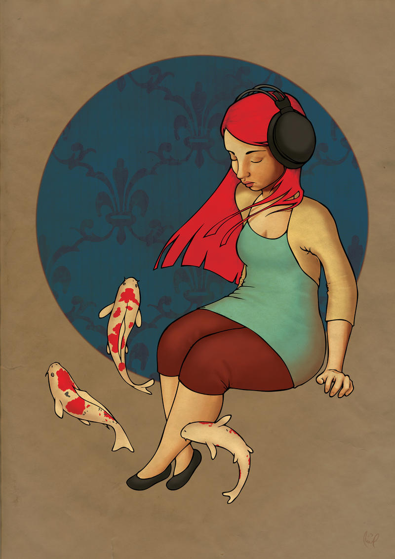
The title was lovingly donated by ~kafine who has been a huge help during the colouring of this. Luvoo Coffee Bean  (Smile)")
I created this for my degree show. Heavily inspired by `loish
Texture from my own scan and from ~AmandaClayton
I created this for my degree show. Heavily inspired by `loish
Texture from my own scan and from ~AmandaClayton
Image size
2480x3508px 4.21 MB
© 2009 - 2024 maxwell-heza
Comments30
Join the community to add your comment. Already a deviant? Log In
Before I start I'd just love to say that I love the title! - And it's always nice to see more realistically proportioned ladies in artwork here on DA, there's no shortage of Barbie-style super-thin girlies around so sometimes it's really nice to see a lady with such wonderful curves!
This is a deceptively different piece for you, Max! - I saw the thumbnail and the colours and fish immediately made me think of the lovely `loish and her beautiful work, so I wasn't surprised when you mentioned her in the description. There are a few traits which keep it separate in style though, so it remains "influenced by" instead of a direct imitation - which is nice. <img src="e.deviantart.net/emoticons/s/s…" width="15" height="15" alt="
The composition is pleasant, and balanced, and the orange of the fishie's really spots pick up and reflect the orange of the hair nicely.
Some of the anatomy looks a little off to me, particularly around the neck and shoulders area - I think in particular you've lost volume in the back of the head/neck area, through down into the shoulder nearest us, however this doesn't ruin the impact or the effect of the piece for me.
There's a strange effect in the colouring/rendering of this piece which I'm sure is totally intentional; the contrast between the very rounded areas which are full of form (like the lovely hips and legs) and then there are very flat areas, like the hair which have little to no rendering.. this isn't a crit more than an observation. - I might be tempted to add a little shine on the headphones - just to distinguish that they're made from a resistant material like plastic and bring a bit more roundness in there.
It would be interesting to see this kind of colouring style taken a step further to see if the artwork could stand up without the line-art. <img src="e.deviantart.net/emoticons/s/s…" width="15" height="15" alt="
In conclusions, this is a lovely experiment Max, which is very successful and I enjoy it a lot. - the minor issues I could spot with it don't take away from my enjoyment of the piece as a whole. <img src="e.deviantart.net/emoticons/s/s…" width="15" height="15" alt="
<img src="e.deviantart.net/emoticons/h/h…" width="15" height="13" alt="